安装
npm install vditor -s
引用
导入依赖包
import Vditor from "vditor";
导入样式
import "vditor/src/assets/scss/index.scss";
使用示例
export default class Vditor extends Component {
constructor(props) {
super(props);
this.state = {
editValue: ""
};
}
componentDidMount = () => {
//组件挂载完成之后调用 注意一定要在组件挂载完成之后调用 否则会找不到注入的DOM
this.createVidtor({ value: this.state.editValue });
}
//创建编辑器 下面会详解
createVidtor = params => {
let { value } = params;
value = value " ";
let that = this;
const vditor = new Vditor("vditor", {
height: 800,
mode: "ir", //及时渲染模式
placeholder: "React Vditor",
toolbar: [
"emoji",
"headings",
"bold",
"italic",
"strike",
"link",
"|",
"list",
"ordered-list",
"check",
"outdent",
"indent",
"|",
"quote",
"line",
"code",
"inline-code",
"insert-before",
"insert-after",
"|",
"upload",
"table",
"|",
"undo",
"redo",
"|",
"fullscreen",
"edit-mode",
{
name: "more",
toolbar: [
"both",
"code-theme",
"content-theme",
"export",
"outline",
"preview",
"devtools",
"info",
"help"
]
},
"|",
{
hotkey: "",
name: "save",
tipPosition: "s",
tip: "保存",
className: "right",
icon: `<img style="height: 16px" src='https://img.58cdn.com.cn/escstatic/docs/imgUpload/idocs/save.svg'/>`,
click() {
that.saveDoc();
}
},
{
hotkey: "",
name: "publish",
tipPosition: "s",
tip: "发布文章",
className: "right",
icon: `<img style="height: 16px" src='https://img.58cdn.com.cn/escstatic/docs/imgUpload/idocs/publish.svg'/>`,
click() {
that.publishDoc();
}
}
],
after() {
vditor.setValue(value);
},
blur() {
that.saveDoc();
},
upload: {
accept: "image/*",
multiple: false,
filename(name) {
return name
.replace(/[^(a-zA-Z0-9\u4e00-\u9fa5\.)]/g, "")
.replace(/[\"")
.replace("/\\s/g", "");
},
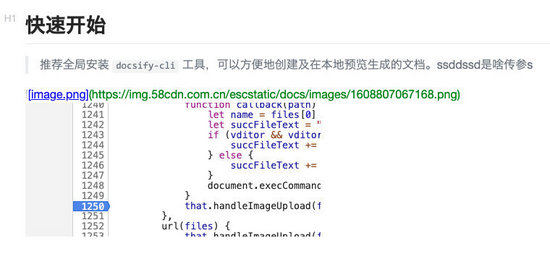
handler(files) {
function callback(path) {
let name = files[0] && files[0].name;
let succFileText = "";
if (vditor && vditor.vditor.currentMode === "wysiwyg") {
succFileText += `\n <img alt=${name} src="/UploadFiles/2021-04-02/${path}">
示例:

功能使用
新建对象
const vditor = new Vditor("vditor", ...option);
新建对象时第一个参数ID,要对应上再render里面注入的ID
option参数
tip:只列举一下常用参数,其他的参数请参照 官方API
参数
说明
height
配置编辑器高度
mode
编辑器模式
wysiwyg:所见即所得2
ir:及时渲染
sv:分屏模式
placeholder
占位符
toolbar
工具栏
Tip:如果要自定义工具栏的话,一定要加上默认的工具栏,不然只展示自定义的了
默认工具栏
tip:此为源码里面copy 不用更改可直接使用,官方已定义好了快捷键和功能
toolbar: [
"emoji",
"headings",
"bold",
"italic",
"strike",
"link",
"|",
"list",
"ordered-list",
"check",
"outdent",
"indent",
"|",
"quote",
"line",
"code",
"inline-code",
"insert-before",
"insert-after",
"|",
"upload",
"record",
"table",
"|",
"undo",
"redo",
"|",
"fullscreen",
"edit-mode",
{
name: "more",
toolbar: [
"both",
"code-theme",
"content-theme",
"export",
"outline",
"preview",
"devtools",
"info",
"help",
],
}]
对应工具栏展示:

自定义按钮
let that = this;
const vditor = new Vditor("vditor", {
toolbar: [
{
hotkey: "",
name: "save",
tipPosition: "s",
tip: "保存",
className: "right",
icon: `<img style="height: 16px" src='https://img.58cdn.com.cn/escstatic/docs/imgUpload/idocs/save.svg'/>`,
click() {
that.saveDoc();
}
},
{
hotkey: "",
name: "publish",
tipPosition: "s",
tip: "发布文章",
className: "right",
icon: `<img style="height: 16px" src='https://img.58cdn.com.cn/escstatic/docs/imgUpload/idocs/publish.svg'/>`,
click() {
that.publishDoc();
}
}
]
});
//tip:在调用本类封装的方法时提前把this赋值给其他方法内的变量,在Vditor内部改变了this指向
参数
说明
hotkey
热键配置
name
功能区分(唯一性)
tip
悬浮提示
className
UI展示 right靠右
icon
按钮图标
click
点击事件
示例:

获取值
saveDoc = () => {
//在初始化时已经把vditor赋值到this对象上 可直接通过getValue方法获取当前编辑器的值
let mdValue = this.vditor && this.vditor.getValue();
//获取完值业务保存就行 这里不再详细写本人的保存方法了
...
}
赋值
let { value } = params;
value = value " ";
//如果是空值的话 最好给一个空格 以免编辑器初始化时报错
const vditor = new Vditor("vditor", {
// value: value,
after() {
vditor.setValue(value);
}
});
//tip:虽说官方也提供value直接赋值 但是在React里面不生效,就需要在after里面去调用setValue来完成赋值
自定义图片上传
const vditor = new Vditor("vditor", {
upload: {
accept: "image/*",
multiple: false,
filename(name) {
return name
.replace(/[^(a-zA-Z0-9\u4e00-\u9fa5\.)]/g, "")
.replace(/[\"")
.replace("/\\s/g", "");
},
handler(files) {
function callback(path) {
let name = files[0] && files[0].name;
let succFileText = "";
if (vditor && vditor.vditor.currentMode === "wysiwyg") {
succFileText += `\n <img alt=${name} src="/UploadFiles/2021-04-02/${path}">
参数
说明
accept
接收文件类型(我这边只做了图片上传)
multiple
是否多选
filename
格式化文件名
handler
点击数触发方法
url
配置此方法时可实现图片粘贴并上传

上传完成后接口返回的CDN地址

上传完成后处理
handler(files) {
function callback(path) {
let name = files[0] && files[0].name;
let succFileText = "";
//上传完成获取当前编辑器模式 根据不同模式拼接不同的展示标签
if (vditor && vditor.vditor.currentMode === "wysiwyg") {
succFileText += `\n <img alt=${name} src="/UploadFiles/2021-04-02/${path}">
总结
以上是本人在接入vditor编辑器是的一些使用总结,更多相关React Vditor内容请搜索以前的文章或继续浏览下面的相关文章希望大家以后多多支持!

更新动态
- 小骆驼-《草原狼2(蓝光CD)》[原抓WAV+CUE]
- 群星《欢迎来到我身边 电影原声专辑》[320K/MP3][105.02MB]
- 群星《欢迎来到我身边 电影原声专辑》[FLAC/分轨][480.9MB]
- 雷婷《梦里蓝天HQⅡ》 2023头版限量编号低速原抓[WAV+CUE][463M]
- 群星《2024好听新歌42》AI调整音效【WAV分轨】
- 王思雨-《思念陪着鸿雁飞》WAV
- 王思雨《喜马拉雅HQ》头版限量编号[WAV+CUE]
- 李健《无时无刻》[WAV+CUE][590M]
- 陈奕迅《酝酿》[WAV分轨][502M]
- 卓依婷《化蝶》2CD[WAV+CUE][1.1G]
- 群星《吉他王(黑胶CD)》[WAV+CUE]
- 齐秦《穿乐(穿越)》[WAV+CUE]
- 发烧珍品《数位CD音响测试-动向效果(九)》【WAV+CUE】
- 邝美云《邝美云精装歌集》[DSF][1.6G]
- 吕方《爱一回伤一回》[WAV+CUE][454M]