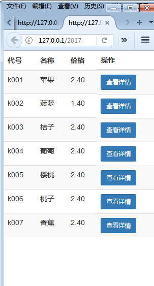
Bootstrap 的响应式 CSS 能够自适应于台式机、平板电脑和手机,现在就bootstrap的响应式举一个例子:

如上图所示,要实现该表格在手机等移动端上只显示代号、名称、和价格,其他以查看详情的方式显示(也就是下图:)

首先,先实现在移动端能由左图到右图的转换:

代码如下:
  <meta charset="UTF-8">
  <title></title>
  <!--引入bootstrap的css文件-->
  <link type="text/css" rel="stylesheet" href="../bootstrap-3.3.7-dist/css/bootstrap.min.css" rel="external nofollow" >
  <!--引入js包-->

  <!--引入bootstrap的js文件-->


  query($sql);
   foreach($arr as $v){

     echo "
     ";
     //为什么id='xq'不行?不要用id,id是唯一的,此处有多个查看详情。。。。记住了!!!!
   }
 "table table-striped">
 <thead>
 <tr>
  <th>代号</th>
  <th>名称</th>
  <th>价格</th>
  <th class="hidden-xs">产地</th> <!-- class="hidden-xs" 目的是在手机上不显示这一列-->
  <th class="hidden-xs">库存</th>
  <th class="hidden-xs">数量</th>
  <th class="visible-xs-block">操作</th>
 </tr>
 </thead>
 <tbody>
  <!--"../DB.class.php";
   $db = new DB();
   $sql = "select * from buyfruits";
   $arr = $db---><tr>
     <td>{$v[0]}</td>
     <td>{$v[1]}</td>
     <td>{$v[2]}</td>
     <td class="hidden-xs">{$v[3]}</td>
     <td class="hidden-xs">{$v[4]}</td>
     <td class="hidden-xs">{$v[5]}</td>
     <td class="visible-xs-block">
     <button type="button" class="btn btn-primary btn-sm xq" code="{$v[0]}" id="xq">查看详情</button>
     </td>
     </tr></tbody>
</table>
其次:实现点击查看详情出现模态框
<!-- 引用模态框(Modal),可以放在任何地方 -->
<div class="modal fade" id="myModal" tabindex="-1" role="dialog" aria-labelledby="myModalLabel" aria-hidden="true">
 <div class="modal-dialog">
  <div class="modal-content">
   <div class="modal-header">
    <button type="button" class="close" data-dismiss="modal" aria-hidden="true">×</button>
    <h4 class="modal-title" id="myModalLabel">水果信息</h4>
   </div>
   <div class="modal-body nr" id="neirong"></div>
   <div class="modal-footer">
    <button type="button" class="btn btn-default" data-dismiss="modal">关闭</button>
   </div>
  </div><!-- /.modal-content -->
 </div><!-- /.modal -->
</div>

<script type="text/javascript">
 $(".xq").click(function(){
  var code = $(this).attr("code"); //取属性值

  $.ajax({
   url:"chuli.php",
   data:{code:code},
   type:"POST",
   dataType:"TEXT",
   success:function(data){
    var lie = data.trim().split("^");

    var str="<div>代号:"+lie[0]+"</div><div>名称:"+lie[1]+"</div><div>价格:"+lie[2]+"</div><div>产地:"+lie[3]+"</div><div>库存:"+lie[4]+"</div><div>数量:"+lie[5]+"</div>";
    $("#neirong").html(str);
//    $("#mymodal").modal("show"); 双引号不行!!!
//触发模态框
   $('#myModal').modal('show');
   }
  });
 })
</script>
处理页面:chuli.php
<"code"];
require "../DB.class.php";
$db=new DB();
$sql = "select * from buyfruits where ids='{$code}'";
$arr = $db->strquery($sql);
echo $arr;
?>
以上就是本文的全部内容,希望对大家的学习有所帮助,也希望大家多多支持。
标签:
bootstrap,响应式表格
免责声明:本站文章均来自网站采集或用户投稿,网站不提供任何软件下载或自行开发的软件!
如有用户或公司发现本站内容信息存在侵权行为,请邮件告知! 858582#qq.com
暂无“bootstrap响应式表格实例详解”评论...
更新动态
2026年05月01日
2026年05月01日
- 小骆驼-《草原狼2(蓝光CD)》[原抓WAV+CUE]
- 群星《欢迎来到我身边 电影原声专辑》[320K/MP3][105.02MB]
- 群星《欢迎来到我身边 电影原声专辑》[FLAC/分轨][480.9MB]
- 雷婷《梦里蓝天HQⅡ》 2023头版限量编号低速原抓[WAV+CUE][463M]
- 群星《2024好听新歌42》AI调整音效【WAV分轨】
- 王思雨-《思念陪着鸿雁飞》WAV
- 王思雨《喜马拉雅HQ》头版限量编号[WAV+CUE]
- 李健《无时无刻》[WAV+CUE][590M]
- 陈奕迅《酝酿》[WAV分轨][502M]
- 卓依婷《化蝶》2CD[WAV+CUE][1.1G]
- 群星《吉他王(黑胶CD)》[WAV+CUE]
- 齐秦《穿乐(穿越)》[WAV+CUE]
- 发烧珍品《数位CD音响测试-动向效果(九)》【WAV+CUE】
- 邝美云《邝美云精装歌集》[DSF][1.6G]
- 吕方《爱一回伤一回》[WAV+CUE][454M]